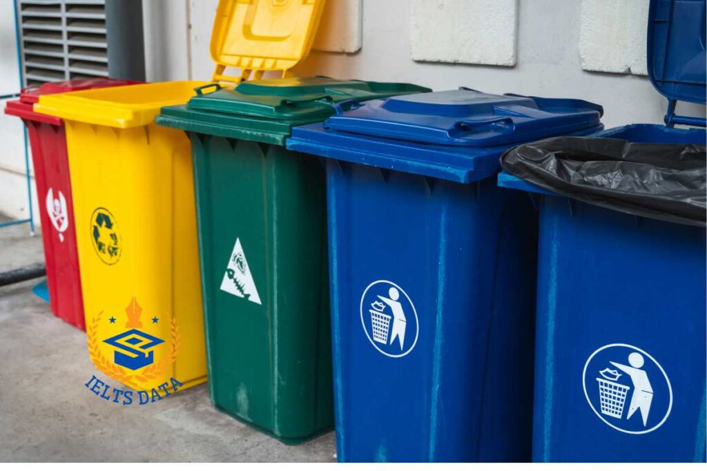
ACADEMIC WRITING

The Graphs Below Show the Types of Music Albums Purchased

The Graphs Below Show the Types of Music Albums Purchased

The Graphs Below Show the Types of Music Albums Purchased by People in Britain According to S@x and Age. Write a Report for A University Lecturer Describing the Information Shown Below. The following bar graphs illustrate the type of music albums bought by people in Britain based on their gender and age categories. The graphs […]

The Graphs Below Show the Types of Music Albums Purchased Read More »

The Bar Chart Below Shows Shares of Expenditures for Five Major

The Bar Chart Below Shows Shares of Expenditures for Five Major

The Bar Chart Below Shows Shares of Expenditures for Five Major Categories in The United States, Canada, the United Kingdom, and Japan in The Year 2009. Summarise the Information by Selecting and Reporting the Main Features and Making Comparisons Where Relevant. The given bar graph demonstrates the percentage of costs such as food, household, transportation,

The Bar Chart Below Shows Shares of Expenditures for Five Major Read More »

The Line Chart Shows the Percentage of People of Different Age Groups

The Line Chart Shows the Percentage of People of Different Age Groups

The Line Chart Shows the Percentage of People of Different Age Groups in The City Who Attended Music Concerts Between 2005 and 2015. Summarise the Information by Selecting and Reporting the Main Features and Making Comparisons Where Relevant. Sample Answer: The Line Chart Shows the Percentage of People of Different Age Groups The line graph

The Line Chart Shows the Percentage of People of Different Age Groups Read More »

The Table Chart Illustrates Data on Underground Railway Systems in Six

The Table Chart Illustrates Data on Underground Railway Systems in Six

The Table Chart Illustrates Data on Underground Railway Systems in Six Major Cities, Kilometres Travelled and The Number of Passengers per Year in Millions. Summarise the Information by Selecting and Reporting the Main Features, and Make Comparisons Where Relevant. The tabular chat enumerates the information regarding the underground railway in six different cities, the distance

The Table Chart Illustrates Data on Underground Railway Systems in Six Read More »

The Pie Charts Illustrate the Average Time Spent by Youngsters

The Pie Charts Illustrate the Average Time Spent by Youngsters

The Pie Charts Illustrate the Average Time Spent by Youngsters on Different Social Media Platforms (Facebook, Twitter, Instagram and Snapchat) in India from 2016 to 2020. Summarise the Information by Selecting and Reporting the Main Features, and Make Comparisons Where Relevant. The charts describe the average time young people in India spent on various social

The Pie Charts Illustrate the Average Time Spent by Youngsters Read More »

The Diagrams Below Illustrate the Public Park when It First Opened

The Diagrams Below Illustrate the Public Park when It First Opened

The Diagrams Below Illustrate the Public Park when It First Opened in 1980 and The Same Park Today. Summarise the Information by Selecting and Reporting the Main Features, and Make Comparisons Where Relevant. The two maps illustrate information about the public park called Grange Park, how it looked in 1920, and what it looks like

The Diagrams Below Illustrate the Public Park when It First Opened Read More »