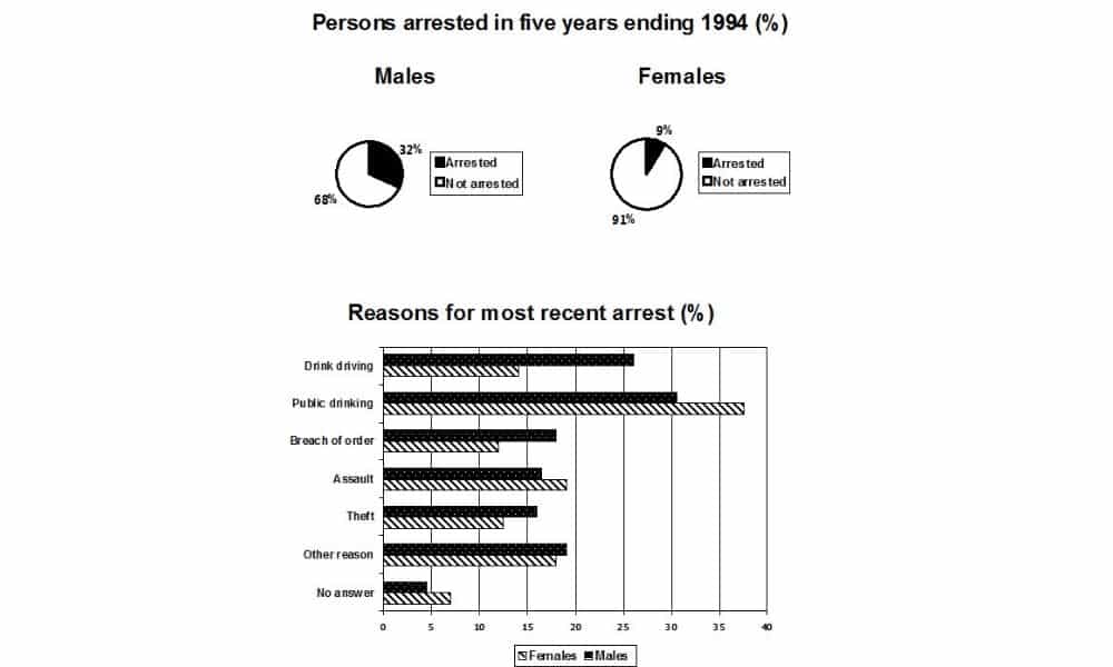
The pie chart shows the percentage of persons arrested in the five years ending 1994 and the bar chart shows the most recent reasons for arrest.
Summarize the information by selecting and reporting the main features and make comparisons where relevant.
Sample Answer of The pie chart shows the percentage of persons arrested in the five years ending 1994 and the bar chart shows the most recent reasons for arrest.
The pie chart enumerates what was the percentage of individuals imprisoned in five years ending 1994.
Overall, it can be vividly seen that males were arrested in more cases as compared to females.
In contrast, according to the pie chart, only 9% of women were put behind bars but males were arrested at 32%. However, it was evident that maximum ladies were put in jail because of public drinking, and according to the provided information around 37% of ladies were caught in public drinking. Apart from this, mostly males arrested cases were seen in drinking while driving and percentage was 22%, in robbery cases 16% and for other reasons 29%. IELTSData Twitter
Moving towards, assault cases of women 16% of females were involved in this illegal activity. Moreover, public drinking and assault were only two cases in which maximum ladies were involved and sent to jail in those years. In no answer, more than 5% of women were put in jail.

