The Chart Below Shows the Amount of Money per Week Spent on Fast Food in Britain. The graph Shows the Trends in The Consumption of Fast Food. Write a Report for A University Lecturer Describing the Information Shown Below.
 Sample Answer: The Chart Below Shows the Amount of Money per Week Spent
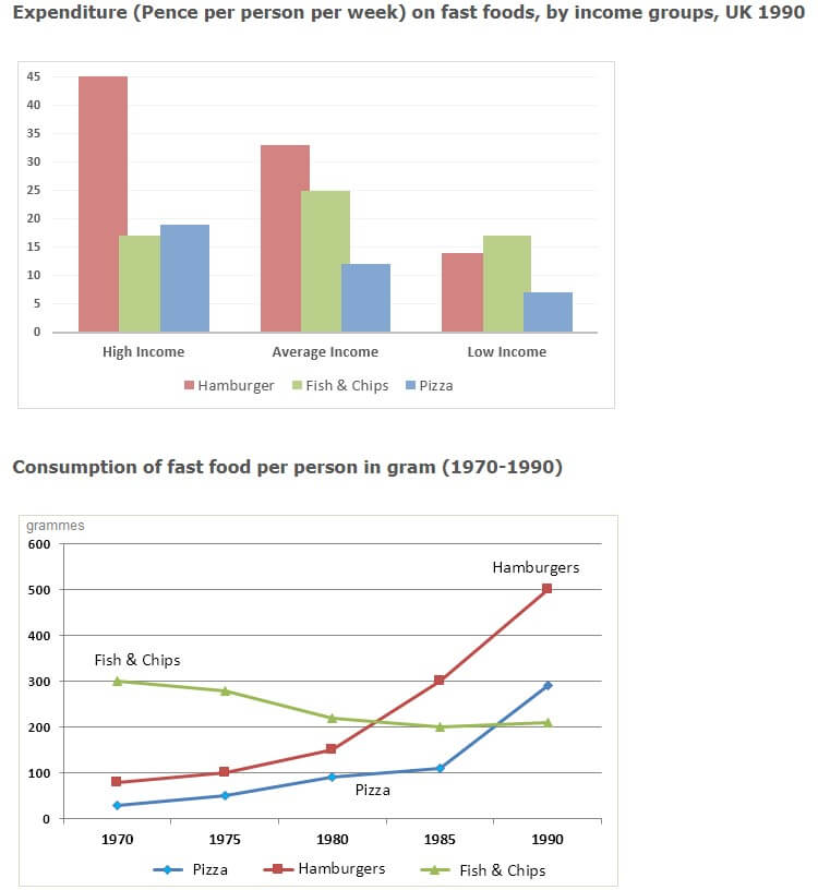
The chart represents the total amount of money spent per week among income earners on fast food in Britain, while the graph illustrates the trend in the consumption of fast food from 1970 to 1900.
Overall, hamburgers were among the highest-consumed meals, while pizza was the lowest-consumed food. In the graph, hamburgers and pizza had a dramatic increase as the years progressed, whereas fish and chips had a downward consumption.
Also, Read Nowadays, Most Countries Are Improving Their Standard of Living
The high-income earners spent 45 pounds on hamburgers, while fish and chips and pizzas cost around 18 pounds. Likewise, the average-income earners spent more on hamburgers, at around 33 pounds. However, there was a lesser expenditure on fish and chips (25 pounds) and pizza (12 pounds). The low-income individuals all spent below 16 pounds on all items.
From 1970 to 1980, hamburger and pizza consumption were below 200 grams but increased as the years progressed. In 1985, hamburgers were 300 grams, while pizza was 100 grams. There was a sharp rise in both: in 1990, hamburgers were 500 grams and pizza 300 grams. On the other hand, fish and chips experienced the opposite: there was a steady decline as the years progressed from 300 grams to 200 grams.
Follow Us On IELTSData Facebook Page For More Updates