
The Chart Below Shows the Amount of Money Spent on Fast Food in Britain per Week. The graph shows the Trends in The Consumption of Fast Food. Write a Report for A University Lecturer Describing the Information Shown Below.
📊 The chart below shows the amount of money spent on fast food in Britain per week. The graph shows the trends in the consumption of fast food. Write a report for a university lecturer describing the information shown below.
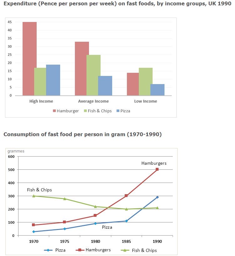
The data provide information on how much money Britons spent weekly on fast food 🍔 and the quantity of consumption over 30 years.
Overall, the graph illustrates that a person with a higher income spends more on hamburgers, nearly 45 pence per week, and their consumption significantly rose to 500 grams. In contrast, people with lower incomes prefer fish and chips, with consumption changing moderately from 300 to 200 grams 📉 between 1970 and 1990.
💷 The bar graph depicting the expenditure on fast foods in 1990 shows that hamburgers were more expensive than fish and chips, as people with below-average incomes did not spend on hamburgers. Next to hamburgers, pizza was preferred by high-income earners. In 1990, hamburgers were superior to pizza, fish, and chips.
To conclude 📈 , at the beginning of 1970, hamburgers and pizza were consumed less than 100 grams, but over the years, their consumption increased compared to fish and chips.
Follow Us on the IELTSData Facebook Page For More Updates