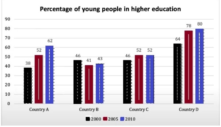
The chart below shows the percentage of young people in higher education in four different countries in 2000, 2005 and 2010. Summarise the information by selecting and reporting the main features and making comparisons where relevant.
 Sample Answer of The Chart Below Shows the Percentage of Young People in Higher Education
The given bar graph illustrates the proportion of individuals who completed higher education in four Different nations in 15 years.
Overall, the maximum proportion of youngsters have completed their higher education in Country D, while the least by country b students throughout the given period.
Having a myopic look at details, the maximum proportion of youngsters passed out their higher education by country D in the initial year, which was noted as 64%. At the same time, most minor students did their university degree by Country A. A similar percentage of individuals passing out education from country C in 2005 and 2010.
Looking at the details, almost two folds more students from country D completed their higher education in 2010 than in country B, who only 43% of students passed university study. 10% more adults were clear his higher education in 2010 compared to 2005 by country B students. It is interesting to note that country D citizens are more educators than other countries.
Follow Us on IELTSDATA Twitter
Also, Read The Table Below Shows The Expenses Per Week of a Retired Single Person and a Couple in Australia.
