The Charts Below Give Information About World Spending and Population. Summarise the Information by Selecting and Reporting the Main Features, and Make Comparisons Where Relevant.
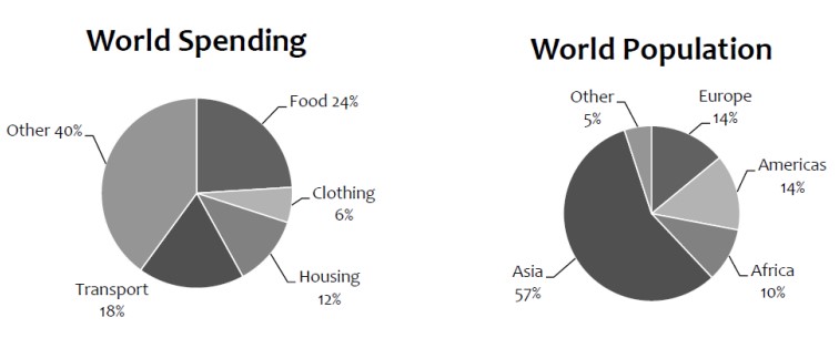 The pie graph illustrates different countries’ public spending on various needs, such as transportation, clothing, food, accommodation, and many other requirements.
To begin with, Asia has the highest population among other continents, accounting for almost 57%. Americans and Europeans share the same percentage, 14%. Africa’s population is one-tenth of the planet’s. On the other hand, half of the African residents are marginal citizens.
Most of the population spends money on other basic requirements, which account for 40%. Furthermore, fewer people pay to buy new clothes. Most of society consumes food, which is a basic need, and spends almost one-fourth of their money on it.
Travellers mostly use public transport, paying 18%. Nowadays, citizens invest in new houses every year
Overall, a significant portion of the Asian public pays for necessities when required. 🏠🍲🚌