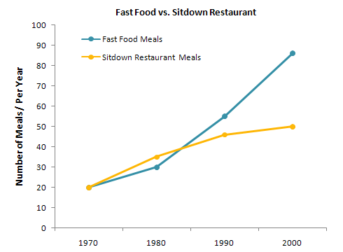
The charts below show the percentage of their food budget the average family spent on restaurant meals in different years. The graph shows the number of meals eaten in fast-food restaurants and sit-down restaurants. Give reasons for your answer and include any relevant examples from your own knowledge or experience.
There are two charts shown, and the first is a pie chart which contains the percentage of food budget which people spent on restaurant meals and on home cooking in four decades. And the second one is the line graph illustrates people take Their number of meals in street food and in the restaurant.
Overall, the percentage of spent money on restaurant meals was increased in decades. It rose 10% to 50% in just four decades. However, a number of people wanted fast food around 20% to 90% this range was the rise in every decade. And restaurant food was decreased (45%)Fast food was more on-demand.
In 1970 and 1980 most of the people like to take meals by cooking at home, and only 10% to 15% of them spent their savings on the restaurant. Other side people preferred junk food and hotels food both around 20% eaten by people in 1970, and it was increased with 25% and 35% in just ten years.
On the other hand, 1990 and 2000 stress food highly rises with 60% to 90% and the restaurant meals was slightly increased approx 45% to 50%. However, people who did not want to eat at home and spent more money on restaurant meals it was increased (15% ) in decades.
Follow Us on IELTSDATA Twitter
Also read: The Graph below Shows the Average Monthly Use of Health Clubs
