The Charts Below Show the Percentage of Water Used for Different Purposes in Six Areas of The World. Summarise the Information by Selecting and Reporting the Main Features, and Make Comparisons Where Relevant.
 Sample Answer: The Charts Below Show the Percentage of Water Used for Different Purposes in Six
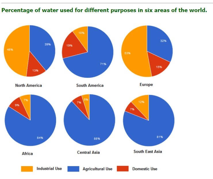
The graph illustrates data on how much water is used in six cities across the world.
Overall, it is noticeable that in South America, the use of water for domestic use is higher than in other cities, whereas in Central Asia, industrial use of water is much less than in the six cities.
Also, Read The Pie Charts Illustrate the Average Time Spent by Youngsters on Different
According to the diagram, water is being used as an industrial resource for both countries, especially in Europe. Demand for water in North America is higher than in any other country. However, the demand for water for agricultural use is lower among the six cities. In Addition, South America uses a lot of water for agricultural fields.
Moreover, Central Asia needs more water for agricultural use, but it doesn’t require any other use after that. Both countries in Southeast Asia and Africa are gaining less water for domestic use.
Follow Us On IELTSFever Facebook Page For More Updates