The Charts Below Show the Proportion of People’s Total Spending in A Particular European Country that Was Spent on Different Commodities and Services in 1957 and In 2008. Summarise the Information by Selecting and Reporting the Main Features and Make Comparisons Where Relevant.
 📊 The two pie charts illustrate how people spent money on different commodities in a particular European country, percentage-wise, between 1957 and 2008.
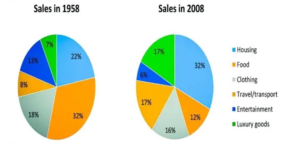
📉 Overall, it is noticeable that at the beginning of the period, food contributed to the largest sector of expenditure, while luxury goods were the least significant sector. In comparison, at the end of the period, housing became the most significant spending category, while entertainment was the smallest sector of expenditure.
📈 To start with, in 1958, spending on housing, which was 22%, increased dramatically to 32% in 2008, making it the largest spending category. Also, travel and sport accounted for 8% in 1958 and rose significantly to 17% in 2008. Meanwhile, luxury goods were 7% in 1958 and doubled to 14% in 2008.
📉 However, expenditure on food, which was the largest sector in 1958 at 32%, decreased dramatically to 12% in 2008. Additionally, clothing was 18% in 1958 and reduced by 2% to 16% in 2008. In the meantime, entertainment accounted for 13% in 1958 and became the least significant spending category in 2008 at 6%.
Follow Us on the IELTSData Facebook Page For More Updates