


The graph below shows the amount of UK investments in clean energy from 2008 to 2015. Summarise the information by selecting and reporting the main features, and make comparisons where relevant.

The graph below shows the amount of UK investments in clean energy from 2008 to 2015.
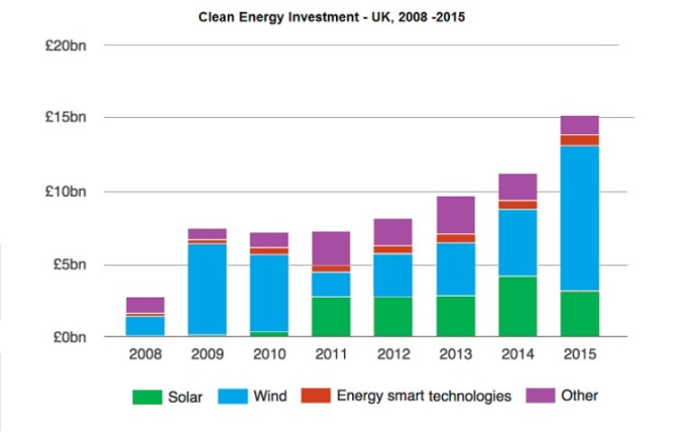
The bar graph provides information on the sum of money used to purchase clean energy sources in the United Kingdom over seven years from 2008.
Overall, it is clear from the illustration that wind received a massive investment from the start of the recording period up to the end, and the least funded type of energy was energy-smart technologies. Funding for solar and other sources continued to show a fluctuating trend over the seven years.
Wind energy remained the highest funded from 2008, with a considerable amount of almost £9bn being allocated in 2015. The other sources received around one bn to 4bn in the whole recording period. On the contrary, energy-smart technology was the most minor funded type of energy, which got approximately half a billion pounds and never exceeded the £1bn mark.
Other sources of energy continued to get a steady investment which never surpassed three bn and the highest of almost 2.5bn being in the years 2011 and 2013. However, solar power investment began in 2010, with a meagre amount of below half a billion pound; nonetheless, a surge in funding was noted the following year, reaching £2.5 bn, which remained in the constant for all other years except 2014, which outshined the other years with a whooping £4bn in funding.
Follow Us on IELTSDATA Twitter
Also Read The Maps Show The Change of Pentland From 1980 to 2007