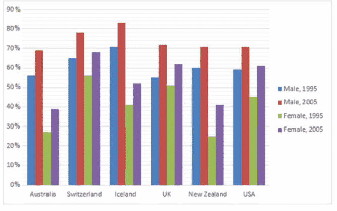
The graph below shows the information on employment rates across 6 countries in 1995 and 2005.
Write at least 150 words
Sample Answer of the AC Writing The graph below shows the information on employment rates across 6 countries in 1995 and 2005.
The given bar graph illustrates the employment rates of males and females in 6 countries, namely Australia, Switzerland, Iceland, the UK, New Zealand, and the US in the years 1995 and 2005.
It is evident that the maximum employment rate was of males in Iceland at just above 80%, closely followed by Switzerland with a percentage of slightly less than 80%, in 1995. Huge variations can be observed in Australia and New Zealand, with a difference of almost 30% in rates of men and women employed, in both years.
In all 6 countries, males were employed consistently, way more than their female counterparts, with the only exception being the UK in 1995, where the employment rates of men and women were around 53% and 51% respectively.
Overall, growth in the rate of employment can be seen between 1995 and 2005 for both genders individually, according to the census gathered from the 6 nations.
So this is the End of the AC Writing ( The graph below shows the information on employment rates across 6 countries in 1995 and 2005. )
