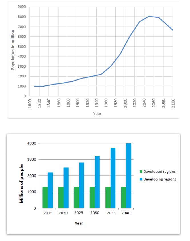
The graphs below provide information on global population figures and figures for urban populations in different world regions. Summarise the information by selecting and reporting the main features, and make comparisons where relevant.

The line graph illustrates the information regarding the comparison of the populace in different years, namely 1800to 2100. at the same time, the bar chart depicts the information about developed nations in five different years. The data has been calibrated in millions.
Looking at the overall perspective, it is readily apparent that the populace was minimum in the initial year. At the same time, it will rise sharply in the future.
Apparently, it is crystal noticeable that from the year 1800 to 1840, the population remained the same. Apart from that, in the developed nations, the proportion was approximately a 1100million in 2015. Then the global population will be rose from 1940 to 2100, shared by an upward trend. After that, it reached its peak point in 2040.
Turning towards the remaining data, in 2035, the 3500 million people lived in the well-maintained areas. In contrast, the populace of the developed region decreased in other years as compared to 2040.
Follow Us on IELTSDATA Twitter
