
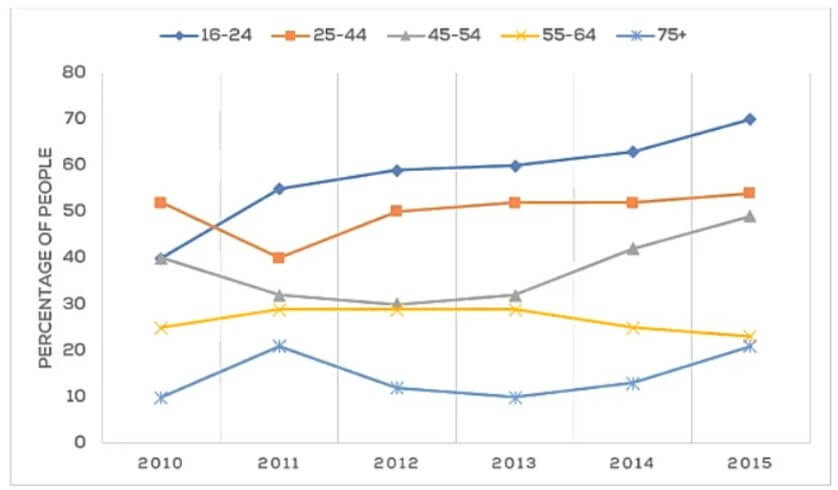
The Line Chart Shows the Percentage of People of Different Age Groups in The City Who Attended Music Concerts Between 2005 and 2015. Summarise the Information by Selecting and Reporting the Main Features and Making Comparisons Where Relevant.
 Sample Answer: The Line Chart Shows the Percentage of People of Different Age Groups
The line graph illustrates the percentage of locals with different age groups who attended live concerts from 2005 to 2015.
Focusing on the line graph, there was a sudden increase in music concerts enjoyed by adolescents between 2005 and 2015. It has been shown that from 2005 to 2010, the percentage of younger age groups went down stably. Surprisingly, around 40% to just over half of the youngest people rose quickly.
Also, Read The Chart Below Shows the Internet Users (in Millions) in Different
However, the percentage of 45 to 54 age group people were fluctuating between 40% to just under half. Moreover the ratio of 55 to 64 age group people reduced continuously about enjoyed the live music. Surprisingly, there has been a sudden increase in seniors enjoying the concerts.
Also, the percentage of senior citizens fell dramatically and went up significantly. The line graph presents the fluctuation in seniors regarding live music from 2005 to 2015. Almost 20% of old-school people enjoy music now.
Overall, remarkable variations were seen regarding live concerts. Almost all age groups enjoyed live music, except for the 55- to 64-year-old group.
Follow Us On IELTSFever Facebook Page For More Updates