
The Line Graph Shows the Cost of Watching Films. The pie Charts Show the Change in The Percentage of Market Share Represented by The Three Forms.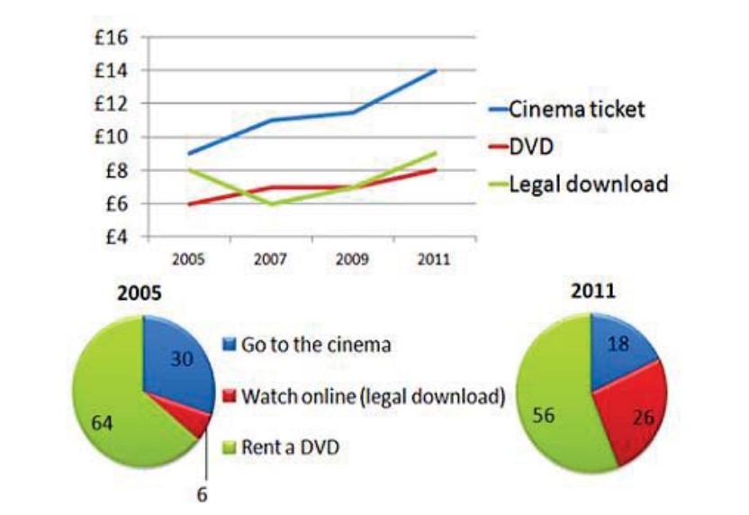
The line graph represents the price difference of cinema tickets, DVDs, and legal downloads from 2005 to 2011. The pie chart illustrates the percentage of these three formats in market share during this period📉.
Overall 📊 , the majority of viewers preferred to rent a DVD to watch films because it was cheaper than the other two formats. The line graph shows how much money was spent on three formats of watching movies from 2005 to 2011. In 2005, the cost of a cinema ticket was the highest, around 9 pounds.
It increased through the years, ending up at 14 pounds in 2011. From 2005 to 2007, the cost of DVDs decreased from 8 to 6 pounds. However, it only increased from then on through 2011. The price of legal downloads was 8 pounds in 2005 and ended up at 9 pounds in 2011.
The pie chart shows the public’s preference for different formats to watch movies. From 2005 to 2011, the percentage 📈 of renting DVDs slightly decreased from 64% to 56%. Meanwhile, due to the easy availability of the internet, the percentage of watching movies online drastically increased from 6% to 26% during this period.
Despite the high cost of cinema tickets, the percentage of the audience who went to the cinema to watch movies decreased from 30% to 18% between 2005 and 2011.
Follow Us on The IELTSData Facebook Page For More Updates