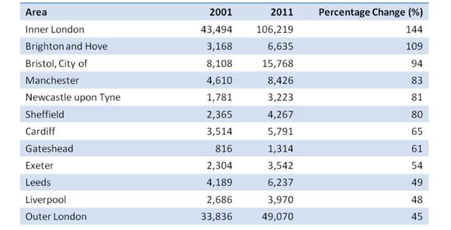
The Table Below Shows Changes in The Number of Residents Cycling to WorkThe Table Below Shows Changes in The Number of Residents Cycling to Work in Different Areas of The UK between 2001 and 2011. Summarize the Information by Selecting and Reporting the Main Features, and Make Comparisons Where Relevant.
The tabular chart depicts the difference in the figure of natives who used cycles to go to work in various cities in the UK from 2001 to 2011 and expresses the percentage change as well.
Overall, from the data, it can obviously be noticed that the number of cycles increased over a period in all the cities. The highest percentage of cycles was in inner London, while the lowest percentage could be seen in outer London.
To begin with, a significant number of residents of inner London commuted by bicycle; however, their figures went up and reached about 106 thousand, where the percentage was 144%. Outer London, on the other hand, had the second largest cycle of commuters and a percentage change of only 45%, which was the lowest among all the other countries given in the table.
In regard to further details, although Brighton and Hove had the second largest percentage change(109%) in the number of residents cycling to work, Bristol was the UK’s third largest commuters, with figures of about 8000 and 15000 respectively. Gateshead had the lowest number with 816 and 13 14 commuters, while the figures for all other countries were below 10000 in both years.
Follow Us On Facebook IELTSData Page

