The Diagram Details The Process of Making Wool
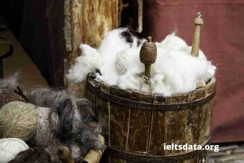
The diagram details the process of making wool. Summarize the information by selecting and reporting the main features, and make comparisons where relevant. Sample Answer of The Diagram Details The Process of Making Wool The provided pictorial illustration demonstrates information about how to manufacture products from wool. It can be seen from the diagram, first […]
The Diagram Details The Process of Making Wool Read More »