Writing Task 1

The Table Below Shows the Proportion of Different Categories of Families (1)

The Table Below Shows the Proportion of Different Categories of Families

The table below shows the proportion of different categories of families living in poverty in Australia in 1999. Summarise the information by selecting and reporting the main features, and make comparisons where relevant. The given tabular chart depicts the information regarding the ratio of families who lived in Australia in the year 1999. The units […]

The Table Below Shows the Proportion of Different Categories of Families Read More »

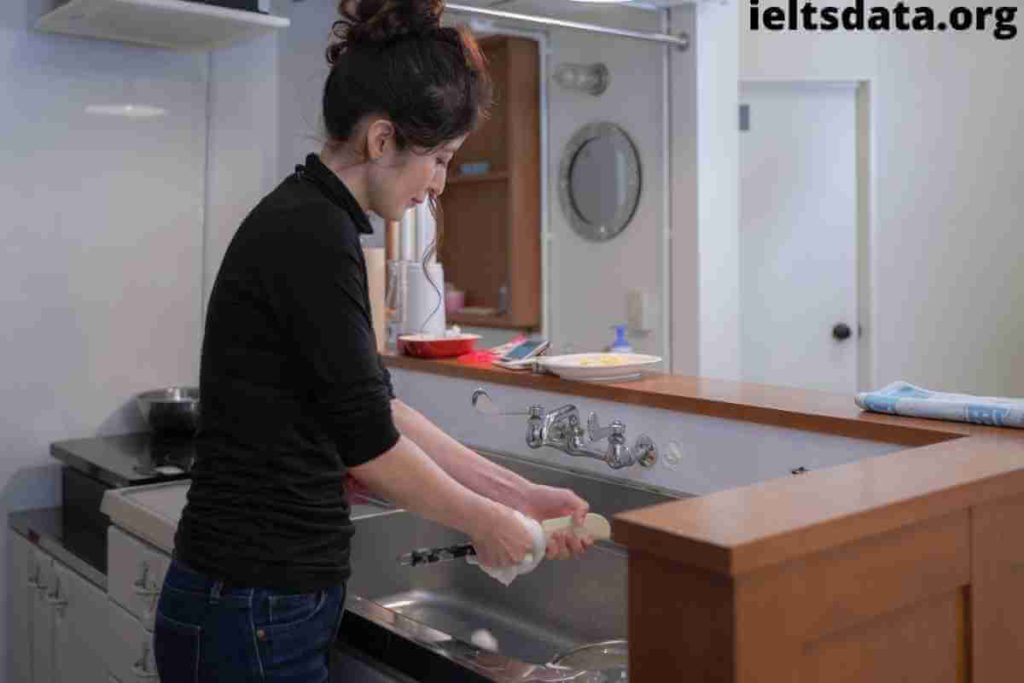
Housework Women Did

The Bar Chart Below Shows the Average Duration of Housework Women Did

The bar chart below shows the average duration of housework women did (unemployed, part-time employed, and full-time) when compared to men who had full-time work in the UK between 1985 and 2005. Summarise the information by selecting and reporting the main features, and make comparisons where relevant. The bar chart describes the comparison of the

The Bar Chart Below Shows the Average Duration of Housework Women Did Read More »

You Relocated to An Overseas Country Recently and Shipped Your Furniture (2) (1)

You Relocated to An Overseas Country Recently and Shipped Your Furniture

You relocated to an overseas country recently and shipped your furniture and other possessions through a shipping company. When you received them, you found some of them got damaged. Write a letter to the delivery manager of the shipping company: When and where the shipment was Describe the damages What do you want the shipment

You Relocated to An Overseas Country Recently and Shipped Your Furniture Read More »

The Charts Below Show the Percentage of Their Food Budget the Average Family (1)

The Charts Below Show the Percentage of Their Food Budget the Average Family

The charts below show the percentage of their food budget the average family spent on restaurant meals in different years. The graph shows the number of meals eaten in fast-food restaurants and sit-down restaurants. Give reasons for your answer and include any relevant examples from your own knowledge or experience. There are two charts shown,

The Charts Below Show the Percentage of Their Food Budget the Average Family Read More »

The Chart Below Shows the Number of Men and Women in Further Education in Britain (1)

The Chart Below Shows the Number of Men and Women in Further Education in Britain

The chart below shows the number of men and women in further education in Britain in three periods and whether they were studying full-time or part-time. Summarise the information by selecting and reporting the main features, and make comparisons where relevant. The render bar charts enumerate how many male and female learners completed further education

The Chart Below Shows the Number of Men and Women in Further Education in Britain Read More »