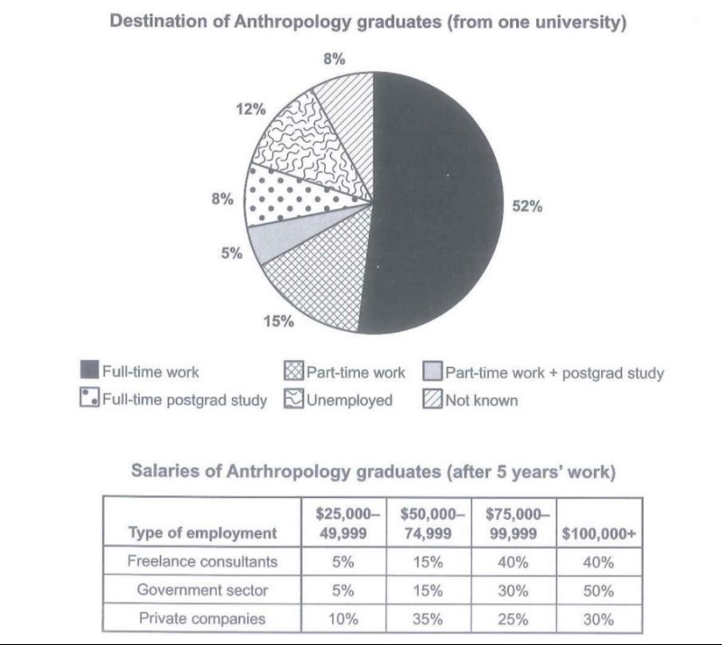
The Chart Below Shows What Anthropology Graduates from One University Did After Finishing Their Undergraduate Degree Course. The Table Shows the Salaries of The Anthropologist’s Work After Five Years. Summarise the Information by Selecting and Reporting the Main Features and Making Comparisons Where Relevant.
The pie chart represents the percentages of the amount spent by the UK educational institution in the years 1981,1991 and 2001 in various categories.
From the given data, it is observed that the British spend almost half of their expenditure on providing salaries to the teachers. Whereas they considered insurance as the least requirement and spent the least amount on it.
It is observed that the teacher’s salary in 1981 was 40% and it increased to 50% after ten years; in contrast to this, the spending amount for wages has dropped to 45% by 2001. Along with this, the other workers‘ payment has consistently reduced each decade. While in 1981 it stood at 28% of total expenditure however this percentage fell sharply to 22% and 15% in the corresponding years.
On the other hand, insurance has risen steadily from 1981 to 2001. Initially, it was at 2%, but at the end of the third decade, it stood at 8%, which is almost triple the initial value. In addition to this, resources and furniture were holding 15% at the beginning. Whereas, in 2001, 9% was allocated for resources besides this money for sitting chairs or equipment has been increased to 23% by the UK education system.
