


The graph below shows the Gross Domestic Products (GDP) in four selected countries between 2010 and 2015. Summarize the information by selecting and reporting the main features, and make comparisons where relevant.
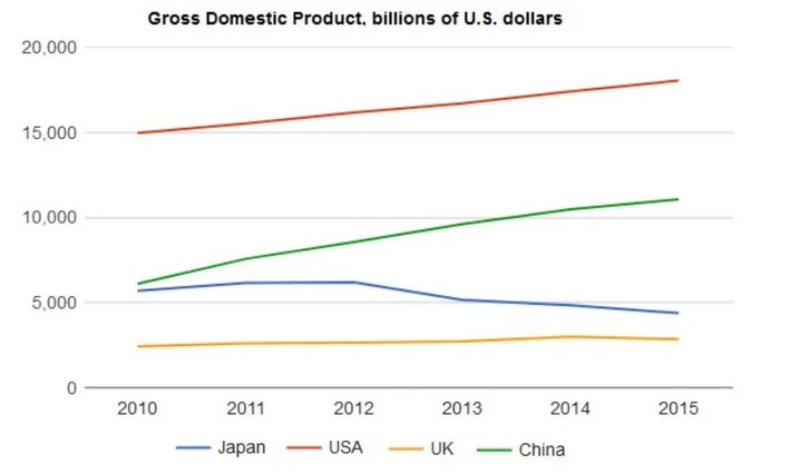

The line graph delineates the information about the Gross domestic products(GDP) in four varied nations, namely Japan, USA, UK, and China. The years under consideration are from 2010 to 2015.
Overall, the USA had the most GDP over the period of time without any fall. On the other hand, the UK has the least GDP when compared to the remaining countries. The unit was considered as billions of US dollars.
To commence with, the lowest GDP is having for the UK nation with only slight changes from 2010 to 2015, starting from approximately 2,500 billion dollars. As a result, it remains a plateau. Meanwhile, the following nation is Japan, with just over 5000 billion dollars originating from 2010, and with slight changes until 2012. Whereas, from 2012 to 2013, the GDP was declined to 5000 billion dollars respectively. Furthermore, from 2013 to 2014, there remained steadily without any fluctuations, and thereafter it slightly declined.
Conversely, China raised from approximately 5500 billion dollars in 2010 to 10500 billion dollars approximately in 2015. Consequently, there are no fluctuations over the period of time in China. Likewise, the USA GDP was climbed from 15000 billion dollars in 2010 to approximately 18000 billion dollars in 2015 without any free fall.
Follow Us on IELTSDATA Twitter