The Line Graph Below Shows the Percentage of Tourists to England Who Visited Four Different Attractions in Brighton. Summarize the Information by Selecting and Reporting the Main Features and Making Comparisons Where Relevant.
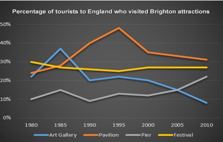
The chart shows the percentage of visitors to England who went to four unique attractions in Brighton. The data is given in percentages through a line graph.
The highest proportion is pavilion it was almost a quarter in 1980 it continued increasing until 1995 to about a half after that it started to decline to nearly 35% in 2000 moreover it reached about 30% in 2010 for the more the art gallery started with about 21% in 193 increase at nearly 47% in 1985 in addition. The dramatic decrease will at one-fifth in 1990. After that, it went down slowly in 2010 at nearly 20%.
On the other hand, the Festival started at 30% in 1980 and a little bit went down in 1985 to 2000 after that it has on a constant level until 2010 noticed as 38%.
On the other hand, Pier started at 10% and increased slightly about 15% in 1985, then in 1990, again to 10%. Moreover, after 1999, it continuously went up by about a quarter in 2010.
Follow Us On IELTSData Facebook Page For More Updates
In conclusion, most visitors vent in Britain to the Sindhi art galleries and pavilions; on the other hand, Festival and Pearl were on average for visitors the whole time.