The Line Graph Shows the Average Number of Weekly Patients Visiting Four Clinics of A Hospital from 2010 to 2016. Summarise the Information by Selecting and Reporting the Main Features and Making Comparisons Where Relevant.
 Sample Answer: The Line Graph Shows the Average Number of Weekly Patients Visiting
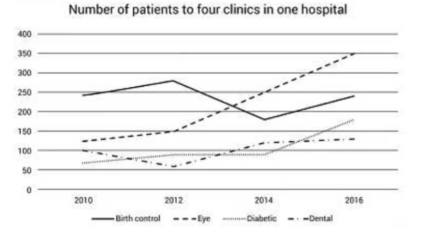
The line graph illustrates the number of patients who visited the four different health centres (birth control, eye, diabetic, and dental) between 2010 and 2016.
Overall, the figure reveals that the number of people with eye problems increased significantly, while the other three had a fluctuating number of patients in the given time period.
Also, Read The Gap Between the Rich and The Poor Is Becoming Wider: Writing Task 2
At first, in 2010, the highest number of patients on birth control was around 240, and it fluctuated, but at the end of the period, it stopped at the same level as it started. Eye cases were approximately 130 in 2010, but they went up dramatically to 350 in 2016, which was the highest patient count among the other three clinics.
There were exactly 100 dental patients in 2010, and the number steadily declined to 50 in 202. However, it increased rapidly to approximately 130 in 2014 and remained the same at the end of the period. Diabetic patients were the lowest among the other three in 2010, at around 60. They increased slightly over the next twenty years to about 90, and in 2016, they rose considerably to 180.
Follow Us On IELTSFever Facebook Page For More Updates