The pie charts compare the expenditure of a school in the UK in three different years over a 20- year period. Summarize the information by selecting and reporting the main features, and make comparisons where relevant.
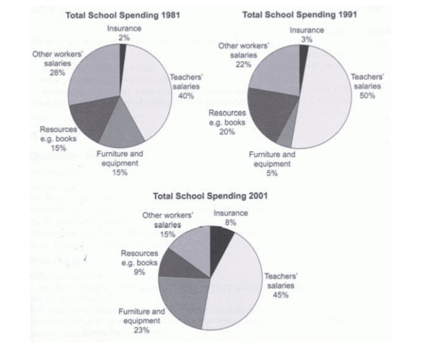
The pie chart illustrates the comparison of Expenditure on UK school in three different years over the period of 2 decades.
In 1981, out of total budget school spend a maximum of 40% on teachers’ salaries whereas least in Insurance (only 2%), although they spend equal amount in stationary and furniture/equipment which was 15% each and 28% on contractor or other workers’ salaries. After 10 years (in 1991), teachers’ salaries took hike by 10% and reached to 50% of total expenses while on other hand expenditure on furniture/equipment got deducted by 10% and reached to 5% only, although expenses on other workers’ salaries and resources (e.g. Books) are quite similar which was 22% and 20% respectively. Lastly, expenses on Insurance was at least, i.e. 3% only.
Moreover, in 2001, teachers’ expenses got decline by 5% and reached to 45% and Insurance took 5% hike and it became 8% in total. On other hand furniture expense was near to quarter (23%) and budget for other workers’ salaries and stationary was 15% and 9% respectively.
Overall, over the span of 20 years, the percentage of Insurance increased, and salaries for other workers got decline.
Follow Us on IELTSDATA Twitter
Also read: The Maps below Show Pancha Village in 2005 and 2015