

The pie charts show the average consumption of food in the world in 2008 compared to two countries China and India. Write a report to a university lecturer describing the data.

Sample Answer of The Pie Charts Show the Average Consumption of Food in the World in 2008
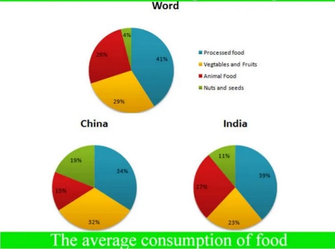
The provided pie charts demonstrate the food’s average consumption by processed food, vegetables and fruits, nuts and seeds and animal foods in the world in 2008 additionally two pie charts compared it, in India and China.
Overall, processed food was the most common, and nuts and seeds were the least priorities food in the world. In China and India, people eat processed food mostly.
Around the world, people prefer 41% processed food while nearly one-third consumption of vegetables and fruits. Nuts and seeds consumption was least on account of 4%, above a quarter consumption for animal foods.
Chinese and Indian people eat mostly processed food, 34% and 39% respectively—15% animal food consumption in china while it is nearly double in India(27). Indian people prefer 23% vegetables and fruits; however, in China, it’s 10% more consumption. For nuts and seeds type food, 11% consumption in India was also lowest proportional, while 19% in China.
Follow Us on IELTSDATA Twitter