The Table Chart Illustrates Data on Underground Railway Systems in Six Major Cities, Kilometres Travelled and The Number of Passengers per Year in Millions. Summarise the Information by Selecting and Reporting the Main Features, and Make Comparisons Where Relevant.
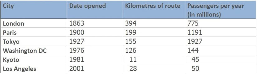
The tabular chat enumerates the information regarding the underground railway in six different cities, the distance of the route and the number of passengers per year in millions. The data has been calibrated in numbers.
Turning towards the specifications, the highest number of passengers used the underground railway service in Tokyo, which was noted to be 1927 million passengers per year, to travel a route of 155 km.
Also, Read The Line Chart Shows the Percentage of People of Different Age
Besides, the distance of the route for the underground railway that was opened in the year 1976 in Washington DC was in close range with the route in Tokyo, which was observed to be 126 km. Interestingly in 1981, another underground rail line was laid down which was the shortest route only 11 km and had only 45 million passengers per year.
To be more precise, in 1863 an underground rail was inaugurated which travelled a route of 394km and facilitated 775 million people per year. Whereas the underground transport service in Paris facilitates 119 million individuals per year to travel a distance of 199 km. Lastly, the metro rail service in Los Angeles travels only a distance of 28 km with 50 million fare payers.
In an overview, it can be seen that the longest route is travelled by the underground transport service of London however, the shortest route is travelled by Kyoto.
Follow Us On IELTSFever Facebook Page For More Updates