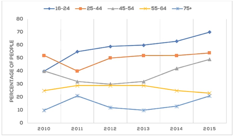
 The line chart gives information about the attendance at music concerts for people of various ages who lived in the city from 2005 to 2015.
Overall, both groups of (16-24) and ( 45-54 )and (75+ )had increased throughout these periods, but the first bracket reached a significant number of visitors. The attendance of the middle-aged, who are about( 25 to 44 )remained stable until the last year, except the divide between ( 55 to 65 )has decreased in the last three eras.
Firstly, in terms of the number of visitors (16-24 ) has grown enormously, and by 2015, it reached approximately 68% in comparison to the percentage of (25-44) which began exactly a half, and a slight drop in the second period, and thus, grew to be the same rate when it started between 2012 to 2015.
However, the figure for the age (45 to 54)has risen substantially by nearly half. Even though members (55-64) began with a higher than those who were (75+ )old, at the last interval, both of them had a tiny fraction.
Follow Us On IELTSData Facebook Page For More Updates.