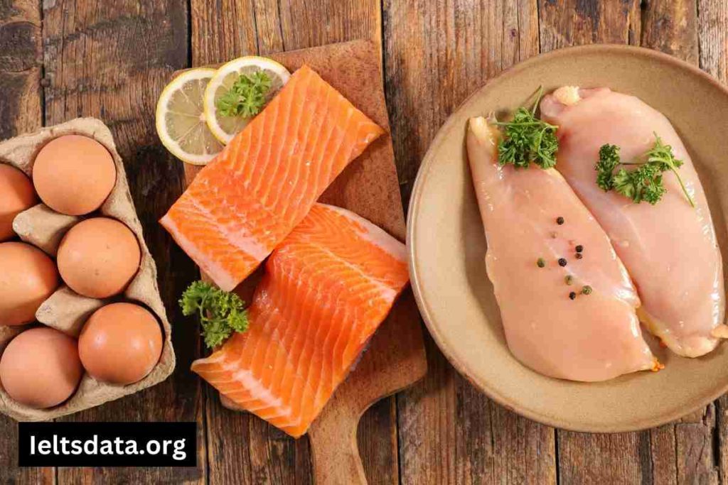
Writing Task 1

The Bar Chart Shows the Typical Weekday for Students in Three Different Countries (3)

The Bar Chart Shows the Typical Weekday for Students in Three Different Countries

The bar chart shows the typical weekday for students in three different countries. The bar chart shows the typical weekday for students in three different countries. The infographic representation in the form of a bar graph illustrates the information about learners in the UK, Japan, and Germany who are sleeping, studying and relaxing on a […]

The Bar Chart Shows the Typical Weekday for Students in Three Different Countries Read More »

The Chart Below Shows the Figure for Work Hours per Week in The Industrial Sector

The Chart Below Shows the Figure for Work Hours per Week in The Industrial Sector

The chart below shows the figure for work hours per week in the industrial sector in four European countries in 2002. Summarise the information by selecting and reporting the main features, and make ccomparisons where relevant. The bar graphs depict the number of hours worked per week in the industrial sectors in France, Denmark, Sweden,

The Chart Below Shows the Figure for Work Hours per Week in The Industrial Sector Read More »

The Bar Chart Provides Information About how Families in A Country Spent Weekly Income in Both 1968 and 2018

The Bar Chart Provides Information About how Families in A Country Spent Weekly Income in Both 1968 and 2018

The bar chart provides information about how families in a country spent weekly income in both 1968 and 2018. Summarise the information by selecting and reporting the main features and comparing where relevant. The bar chart illustrates the amount of money families spent weeks between 1968 and 2018. Overall, the amount used for household goods remained

The Bar Chart Provides Information About how Families in A Country Spent Weekly Income in Both 1968 and 2018 Read More »

The Graph Below Shows the Weekday Volume of Passenger Activity on The Toronto Metro System for July 2007 (3)

The Graph Below Shows the Weekday Volume of Passenger Activity on The Toronto Metro System for July 2007

The graph below shows the weekday volume of passenger activity on the Toronto Metro system for July 2007. Summarize the information by selecting and reporting the main features, and make comparisons where relevant. The graph illustrates information on travellers travelling during working days using the Toronto Metro System in July 2007. The scale of the

The Graph Below Shows the Weekday Volume of Passenger Activity on The Toronto Metro System for July 2007 Read More »

The Chart Below Shows the Sales of Handmade Olive Oil Soaps to Tourists in Turkey in 2015 (1)

The Chart Below Shows the Sales of Handmade Olive Oil Soaps to Tourists in Turkey in 2015

The chart below shows the sales of handmade olive oil soaps to tourists in Turkey in 2015. Summarise the information by selecting and reporting the main features and make comparisons where relevant. The line chart is a statistical representation of the trend in the distribution of handmade olive oil soap in the Turkish population during

The Chart Below Shows the Sales of Handmade Olive Oil Soaps to Tourists in Turkey in 2015 Read More »

The Local Government Is Planning to Change the Bus Timetable (1) (1)

The Local Government Is Planning to Change the Bus Timetable

The Local Government Is Planning to Change the Bus Timetable. You Are Not Happy About the Proposed Changes. You Have Decided to Write About It to The Local Newspaper Editor. Write a Letter to The Newspaper. in The Letter, Describe the changes. Explain how that will affect you. Say how you would like the service

The Local Government Is Planning to Change the Bus Timetable Read More »