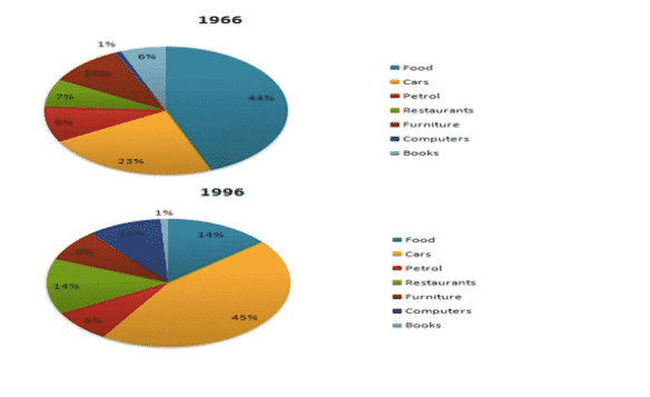
The given pie charts compare the expenses in 7 different categories in 1966 and 1996 by American Citizens.
Summarise the information by selecting and reporting the main features, and make comparisons where relevant.
You should spend about 20 minutes on this task.
Sample Answer of expenses in 7 different categories in 1966 and 1996 by American Citizens.
A couple of pie charts manifest the information regarding the expenditure spent by Americans on seven miscellaneous categories in 1966 with that of 1996. The data has been calibrating in percentage.
Overall, the most striking feature is the highest expense ratio by Americans foodstuff and least on purchasing computers, in 1966. However, after three decades, they spent the biggest portion of their income to own cars and a negligible amount on books.
As is presented in the pie charts, in 1966, the lion’s share (44%) part of the income was spent on foodstuff. Whereas, merely 14% of income spent on meals, in 1996. In the case of cars, nearly a quarter of expenses went on it, in 1966. But after three decades, its expenditure went doubled. The consumption of petrol was more or less similar in both years. Both restaurants and furniture’s expenditure by the masses were 7% and 10% respectively, in 1966.
However, in 1996, the expense of the former was doubled and the latter was just below the one in ten. The percentile of salary spent on computers increased dramatically, up from 1% in 1966 to 10% in 1996. Expenditure on books had plummeted from six percent to one percent at the end of the year.
