The Graph Gives Information About the Percentage of The Population Of Four Different Asian Countries Living in Cities Between 1970 and 2020, with Additional Predictions for 2030 and 2040. Summarize the Information by Selecting and Reporting the Main Features and Making Comparisons Where Relevant.
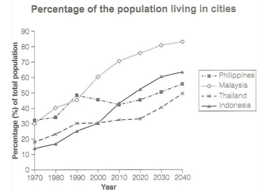
The graph displays data about the proportion of citizens of four varieties of Asian countries who will reside in cities within 50 years, with an extension forecast for 10 years ahead.
Overall, Thailand and the Philippines showed a considerable rise in people in 1970 and were maintained by the end of the period. Malaysia and Indonesia, on the other hand, indicate a sharp rise in population over the whole period.
Also, Read The Table Chart Illustrates Data on Underground Railway Systems
In 1970, the Philippines had the highest proportion of 31% people and rose to a peak of around 48% in 1990, then showed a gradual decline within 20 years.
The percentage of people showed a gradual rise from 2010 throughout the end of the period. However, Thailand rose slightly from 1970-1990 and levelled for a decade; it showed a considerable rise for ten years and is expected to increase in the years ahead.
On the other hand, Indonesia had the lowest population, about 13%, in 1970 and indicated a sharp rise throughout the period.
Malaysia displayed the second highest percentage of people in 1970 and showed a significant increase within 50 years. It is estimated that citizens will be approximately 80% in 2030 and surpass the other three countries, ending at around 82% of the population by 2040.
Follow Us On IELTSFever Facebook Page For More Updates