The Table Chart Illustrates Data on Underground Railway Systems in Six Major Cities, Kilometres Travelled and The Number of Passengers per Year in Millions. Summarise the Information by Selecting and Reporting the Main Features, and Make Comparisons Where Relevant.
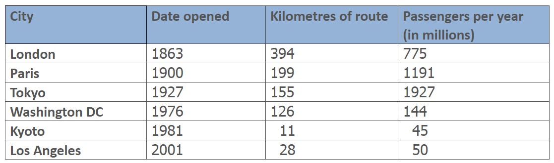 The table gives information about the underground line systems, including the figure of movement per year in millions and the kilometres of routes in these different cities (London, Tokyo, Paris, Los Angeles, Washington, Kyoto).
Overall, even though London was the oldest place with a large population, Tokyo, which had opened recently, covered a significant kilometre. While Kyoto was open before Los Angeles using the railway, it had a small minority of passengers, and others had a modest number of routes.
Firstly, London was open early, and the travelled reached 775 million, accounting for 394 kilometres. Paris was the second city to start using rail, about 1191 million, hence nearly 199 routes. When Tokyo started in 1927, it had a substantial number of passengers in 1927 with fewer kilometres than the first cities. Washington, DC, began in 1976 and covered 144 million by 126 rate of movement.
Finally, both Kyoto and Los Angeles had a tiny fraction of the rail line, except the cost of transport in Los Angeles was a little more than in Kyoto.
Follow Us On IELTSData Facebook Page For More Updates.
Pingback: The Table Below Gives Information About the Underground Railway - IELTS DATA