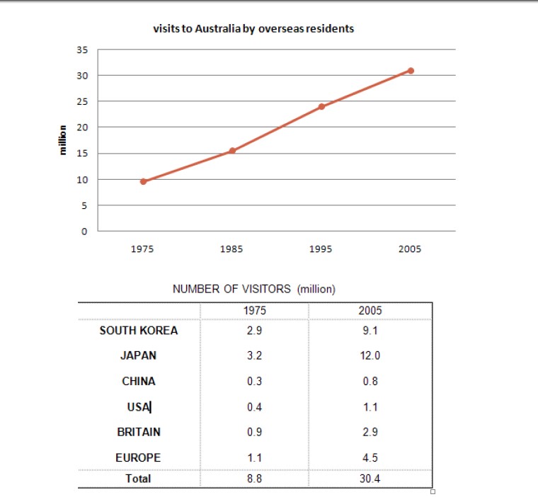
The line graph below shows the number of annual visits to Australia by overseas residents. The table below gives information on the country of origin where the visitors came from. Write a report for a university lecturer describing the information given.
 Sample Answer of The Line Graph Below Shows the Number of Annual Visits to Australia by Overseas Residents
The line graph elucidates the number of yearly travel to Australia by natives around the world and the origin of travellers who visited Australia between 1975 and 2005.
Overall, it is clear that the number of visitors showed an upward trend. Meanwhile, the majority of tourists were from Japan.
Analyzing the line graph, people from overseas who visited Australia in 1975 were witnessed to be just below 10 million and the populace of international visitors inclined gradually to a little more than 15 million in 1985. After two decades, considerably more than 30 million travellers visited Australia.
Moving towards the table chart, in 1975, out of 8.8 million travellers, 2.9 million and 3.2 million visitors were from South Korea and Japan respectively, whereas only 0.3 million travellers were from China. The number of tourists from South Korea, Japan and China inclined to 9.1 million, 12.0 million and 0.8 million in 2005 respectively. In 1975, 0.4 million Americans visited Australia, and after 30 years, the number of American tourists grew to 1.1 million.
Follow Us on IELTSDATA Twitter
