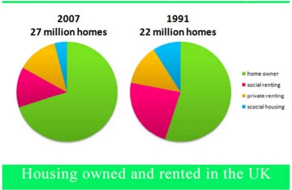
The pie charts below show the percentage of housing owned and rented in the UK in 1991 and 2007. Summarize the information by describing the main features of the charts and making comparisons where appropriate.
Sample Answer The Pie Charts Below Show the Percentage of Housing Owned and Rented in The Uk in 1991 and 2007
The pie charts illustrate information on housing owned and rented in the UK in 2007 and 1991 respectively.
Overall, in both years, there were more homes owned than rented. Homeowners contributed the majority and accounted for over half of the segment in the given time frame, while social housing comprised the least—besides, no noticeable change for private renting in both years.
Moreover, there was an increase in the number of homes in the UK from 22 million in 1991, to 27 million in 2007. Home owned in 1991 as the largest was more than half the segment and in 2007 increased by approximately two-third. Social housing, however, was less than half of a quarter and dropped during the seven years by half.
Regarding social renting, there was a decrease from a quarter of the homes in 1991 to half of its percentage in 2007. On the other hand, private renting was around half of a quarter in both years.
Follow Us on IELTSDATA Twitter
