The Three Pie Charts Below Show the Changes in Annual Spending by A Particular UK school in 1981, 1991 and 2001. Summarise the information by selecting and reporting the main features and make comparisons where relevant.
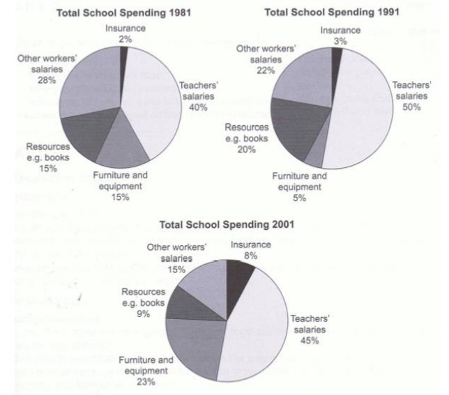
The three pie charts depict the yearly expenditure of a particular school in the UK in the years 1981,1991 and 2001. Overall, the most money was spent on teachers’ salaries, whilst a minor amount was on insurance in the given period.
To begin with, in 1981, nearly half the percentage of the money used by the salary of mentors increased in 1991 by 10% and remained the highest spending in 2001 as well, 45%. Expenditure on the other workers’ salary decreases subsequently over the years with 28%,22% and 15% in the years of 1981,1991 and 2001 sequentially.
Probing further for remaining information, the percentage spent on resources decreased after an incline of 5% in 1991. investment in furniture and equipment saw a substantial decline from 15% to 5%, before increasing again to 23% in 2001. percentages of annual spending were on insurance over the two decades. With a small hike from 2% in 1981 to 8% in 2001.
Also, Read The Graph Below Shows the Quantities of Goods Transported in The UK